Saturday, October 10, 2009

Precedents of Light

We wanted to look at some other options for letting natural light into our building, maybe as an alternative to our skylights (maybe not). Here are a few precedents that we found:


Phaeno Science Center, Zaha Hadid
Our main reason for the skylights is to guide the user through the building (student, faculty, parent). Hadid achieves this same intention through using small slitted windows that supposedly guide the patron through the museum. She also used light to create focal points in the museum, something we had not even thought about yet, but we can see this idea maybe integrating itself into our school.

Institut du Monde Arabe (Arab World Institut), Jean Nouvel
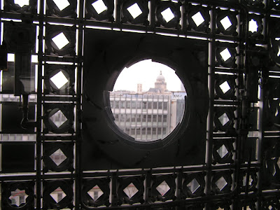
A more pricey option, the building is comprised of different panels that make up a mechanical system to let light into the building. Each individual panel responds to the light outside of the building controlling the amount of light penetration. Reading more about this system, I heard it has never even worked. So not only would this be pricey, but probably ineffective.


Bloch Building, Steven Holl
This is a good precedent in studying how materiality can affect the penetration of light. Holl used a mixture of transparency and translucency to achieve a very dynamic and glowing exterior. The building is wrapped in aluminum mesh, and depending on how tightly or loosely this mesh is wrapped creates different quanitites of light penetration (I'm guessing this affects the quality of light as well). This building also utilizes columns to transmit light downwards. Inside of the columns, the natural light is mixed with artificial light that gives the museum a very rich light to view the artwork.


Seattle Public Library, OMA
When we first saw this picture, we considered this an example of "what not to do". Karl did point out that this type of light rarely happens in Seattle, so this is obviously no offense to Rem, but we do NOT want this type of light for our school. These small penetrations create tons of shadows; imagine finding a spot in the light, five minutes later you would be falling under a shadow. Because of this, I am leaning towards much larger penetrations that would help counteract the temporality of the sun.


Chicago Trip

Thursday, October 8, 2009

Review 10.01.09

Our midterm review with Ellie and Karl was really useful. Ellie brought up a few really good points that we had not heard yet. She really wanted us to start considering the part to whole relationship of our building. For example, in the design we have right now, formally from the outside you can tell the inner-organization of the school. You can see the long, straight hallway lined with classrooms. What if we wanted the outside to convey something totally different and not articulate this long hallway? That is something we hadn't even thought about.

Something we did know is that we needed to start working in section. Our process in plan was finding the lightest spaces and using those to form our circulation, but we also need to do that in section! It is very obvious that we did not have time to work this way yet; our building is very horizontal (almost every roof is horizontal, every room the same height, and all floor slabs are in allignment). We need to use our same process for plans for sections, and this will create way more dynamic and unique spaces, because right now it is just... blah.

We also need to incorporate our helio-spectrum into our plan drawings. Then we could ask ourselves if our process really worked. Are our spaces configurated in a way that takes the most advantage of the sun on the site? We will do this soon!

Something small Ellie said is that we need to show our overhead skylights (probably dotted) in our plans, since this is something our whole building is based around. Very good idea.

Initial Design cont.

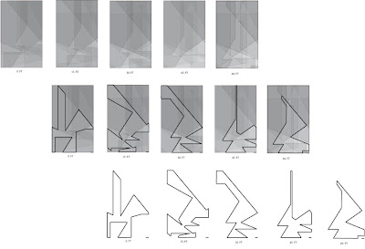
So, we had these traced figures to represent roof plans based off the fact that these areas will recieve the most natural light at 30 ft and 45 ft.


These became the ground floor circulation and the second floor circulation. The more open geometries can serve as a type of congregation space, whereas the thread-like volumes take you to specific places on the site. As I said before, these roof plans allow for us to puncture the roof and create skylights to light the circulation space throughtout the year. We also invisioned this bright circulation space providing light to the THIRTY-FIVE classes we need to light. From this, we placed rows of classrooms along the circulation space (perhaps separated by glass walls) to provide natural light to the classrooms, as well as views into these learning spaces. This type of organization and reliance relates back to the Botanical Gardens. The way that light is traveling from the main circulation space into each of the individual classes is similar to the way that nutrients and water travel from the main vein to the smaller veins.


We also wanted our building to transform in terms of use during the change from day to night, therefore we wanted our building to not only function as a school, but also as a community gathering space. We decided to combine the dining area and the library into one space to create a more dynamic environment in which students could study, eat, read, all in the same area. This is a more efficient way to organize our school because the dining area is used for the reason for only about one hour a day. This space can also be used by the neighborhood after school gets out, where they can grab a snack or even check out a book themselves. For this reason, we placed this multi-use space on the corner for two reasons. Firstly, it would invite people in from all directions, and secondly this place on the site recieves the most direct sunlight. Therefore, the auditorium and gym are not the only areas being used after-school, but so is the library cafe, making the building more public during the evenings.


We also created a model of our shadow plans by etching the shadows into 50 layers of acrylic and painting those lines red. It really doesn't tell us much more than the shadow plans, but is a physical representation of those drawings. It's a different way of reading "dark" and "light" spaces too because instead contrasting tints of black, we are looking for very dense lines. In areas where the red lines read very dense, there are the most shadows.


This is really hard to take a good picture of, and is much more readable when having it in your hands and being able to manipulate the model yourself, but you get the idea!

Sunday, October 4, 2009

Site Analysis + Initial Design

A lot of progress has taken place since the last time I blogged. Our whole studio took a trip to the Ann Arbor Botanical Gardens to learn more about plant behavior in relation to the sun. A very smart man in a hilarious hat took us around the whole garden and answered many questions we had involving the many ways in which plants respond to the sun. Evolutionarily, the texture and overall shape of the leaves, the amount of leaves, and the placement of the leaves from the stem are all in response to the amount and type of sunlight the plant wants to recieve. In a more temporary sense, many plants can be classified as heliotropic or heliophobic, which affects the arrangment of the leaves. This arrangement can change every season, every day, or even every hour. David said that if he flipped a stem of leaves upsidedown, within a day all the leaves would be facing upright again.
The trip to the Botanical Gardens inspired Ashley and I to think about the programmatic requirements and their relation to the sun. We could not only classify certain program types as sun-seeking or sun-fearing, but we also were inspired by the papyrus plant and the way that photosynthesis started in the lower part of the stem, and then moved to the upper part of the stem, leaving a visual indicator of the change in the lower stem by the fact the it turns brown. We also began to think of the light not only quantitively, but qualitively, in that certain types of light can be undesirable, and in terms of a school this could cause glare on a computer screen or even overly-distracted students.


Next we modeled the shadows in Digital Project, which was way more frustrating than we had anticipated... thanks Frank.

Once we got our file to work, we decided to change the azimuth and elevation angles to coorespond to the extremes of a school day (8am, noon, and 3pm), during four different days of the school year (September 21st, December 21st, March 21st, and June 21st). What was important to remember is that September 21st and March 21st share the same azimuth and elevation angles, making these shadows twice as important to consider when designing our building.


Looking specifically at our site, we took sections and plans of all the shadows over these specific times of days. By making them somewhat transparent, and then layering them on top of eachother we had a really good visual of which portions of the site will fall under shadows the most often throughout the year.

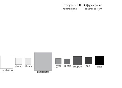
We then had to complete the very necessary task of figuring out with programs would fit best in these layered plans and sections we had created. Which spaces needed the most light? Which spaces needed the least light? This was a very skewed way to think about placing program because all spaces would need light at one time or another. A much more appropriate way to think about it was in terms of natural light vs. controlled light. We could place a space that called for a more controlled lighting, such as the auditorium, in a location on the sight which often falls under shadow. We made a program helio-spectrum to visualize our program in terms of preference to the sun. We visualized a more unconventional hallway in that it is one that recieves tons of natural light. From there, the corridor could even provide light to the thirty-five classrooms we were required to have.

We then traced out the lightest spaces on our site using our shadow plans. Most of the geometries transformed form thread-like to large open volumes, perfect for the way we imagined a circulation space should be. The plan at 30 ft became the roof plan for the ground floor, which allowed us to puncture the roof with skylights to illuminate and guide the patron through the space. The plan at 45 feet served as the roof plan for the second floor allowing for the same type of lighting.


MORE TO COME!